CONCEPT
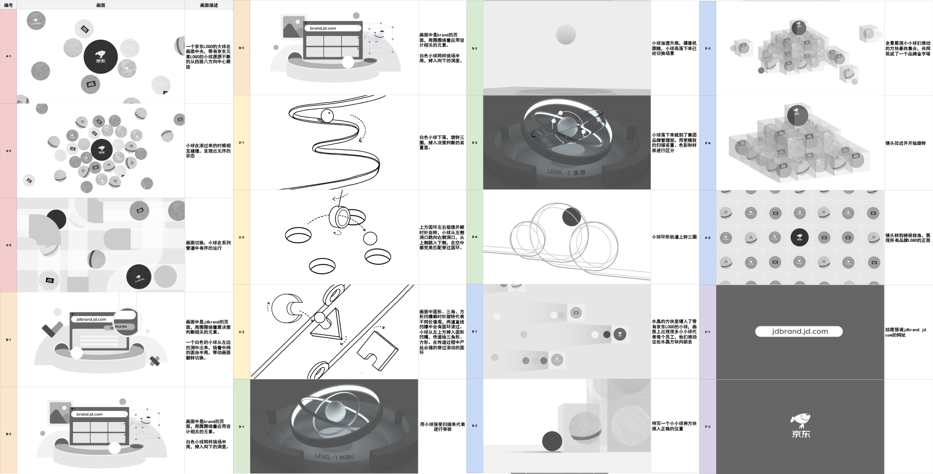
The main content of the video is to introduce the functions of the brand management system. In the video, the white ball represents the newly-named brand. We use the white ball passes through various mechanisms to compare the review process each new brand has to go through. When the review is passed, the ball turns red and joins the JD brand family. Established JD’s brand firewall.

STYLE
Because there are two pairs of similar concepts in the video that need to be distinguished, such as BRAND.COM and JDBRAND.COM. To let the audience distinguish the difference between the two more easily. We used contrast color red and blue for the different scene so that the audience can feel the switch between the two concepts.

Since it’s a small project, and considering that the video has lots of abstract metaphor. In order to complete the video efficiently, we decided to use basic materials with 3D geometric shape as the design style.

KEYFRAME